Figure 21 shows the photo insertion pane. You can insert a photo in the selected card back here. The photo can either be made with a connected camera or loaded from a file. The card back with an inserted picture will be used according to the privacy policy.
When you click any circled number in the picture below, the browser will scroll to the explanation of the numbered item. To return to the picture, click the back button.
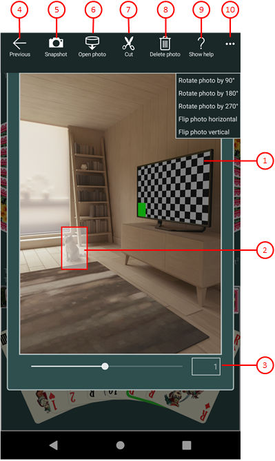
Figure 21: Photo Insertion Pane
- Photo panel
This panel shows either the selected card back, the snapshot taken by the connected camera, or the picture loaded from a file. Initially and after insertion, the selected card back is shown.
- Clipping shape
The border of this shape defines the clipping. You can drag it to the required area for clipping.
- Zooming slider
You can move the slider between 0.05 and 2.0 by dragging the slider thumb. You may also click on the slider behind or in front of the thumb to set a discrete value.
 If you click this button, the pane previously shown is made visible again. If no previous pane exists, the current overlay pane disappears only. Alternatively, you can press the Alt+Left-Arrow key combination.
 If a camera is connected, you can click this button to take a snapshot. The camera app allows you to do this. The picture taken is shown in the photo panel.
 Click this button if you want to load a picture from a file. A File Open Picker allows you to go to the target folder step-by-step and select a picture file from there. Only files with the name extensions ".png", ".jpe", ".jpeg", ".jpg", and ".gif" are shown. The photo loaded is shown in the photo panel.
 Click this button if you want to insert the marked picture area into the selected card back. The clipping shape must be completely be inside the picture. After clipping, the card back with the new insertion is shown in the game appearance pane and all visible card backs in the game view are also be changed. This button is disabled if the photo panel contains the selected card back instead of a new photo.
 Click this delete picture button if you want to remove the photo from the selected card back. After deletion, the default picture is shown again. This button is disabled if the selected card back contains the default picture already.
 Click this button to overlay the game view with the help pane showing online information about the current view content. Alternatively, you can press the F1 key on the keyboard. The help function can be used only if an internet connection is available.
-
 If the current width of the game view does not allow to display all primary commands of the app bar as buttons, the overhanging commands are moved to the list of secondary commands. That list can be opened by pressing this button. Pressing this button also causes the app bar to be displayed in its maximum size. When in maximum size, the app bar shows a description below each button shape. The list of secondary commands is divided into the following sections:
- If primary commands had to be moved due to insufficient width, these are displayed first. This is followed by a horizontal dividing line.
- This is followed by commands for all subsequent overlay panes with which they can be called up directly.
- If an overlay pane provides special commands, these are listed after another dividing line.
- Finally, there is a “<--” command with which you can close the current and all previously displayed overlay panes.
The following secondary commands are displayed:- Rotate photo by 90°
Rotes the photo shown by 90 degrees clockwise. - Rotate photo by 180°
Rotes the photo shown by 180 degrees clockwise. - Rotate photo by 270°
Rotes the photo shown by 270 degrees clockwise. - Flip photo horizontal
Mirrors the photo shown horizontally. - Flip photo vertical
Mirrors the photo shown vertically.